Howto:Glass reflection effect for instruments
Jump to navigation
Jump to search
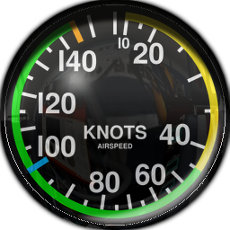
This is a short tutorial to show how to add glass reflection effect to instruments, using graphic tools, so that the reflection effect is already contained in the main instrument image, and not depending on shaders. The result is widely satisfactory and very realistic one, meaning a less CPU load.
You may use any image editing software, but would be useful one with multi-layer support (as GIMP or Photoshop), so you may control each step as a separate layer, adding or subtracting effects one by one.
What's needed
- Original image of instrument at good resolution.
- Real image of cockpit, or something similar (even a car image may be used).
- Multi-layer image editing software.
Steps
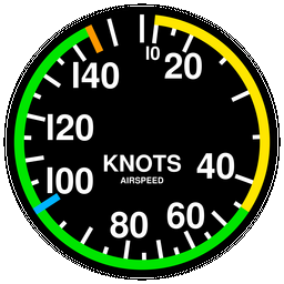
- Do a mask over the empty space of original instrument and save it as a new selection. You will need it all the time to cut the excess material in every step:
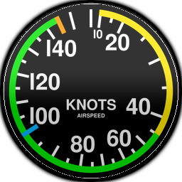
- To the original image of instrument apply an horizontal gradient effect from light to shadow, from top to bottom (at the top there are always more light). It's better to scale point of mixture near the middle, so shadow and light are more evident towards the edges:
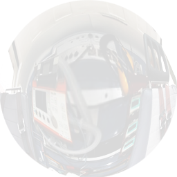
- Put over the main image of the instrument a layer with an a real image of the cockpit where will be used, like viewed from the panel to back side, and apply to it an opacity near 15 or 20%. If the instrument is curved, apply eye fish effect to the cockpit image layer (like to simulate how the reflection would look on the glass). Use an image containing light/shadows contrasts, will be useful to better effect.
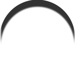
- Apply a curved shadow on the top of the instrument, more or less, depending if needed to simulate the shadow of a socket supporting instrument, or the normal shadow of curved glass. Apply some blur effect, and add near 80% of opacity:
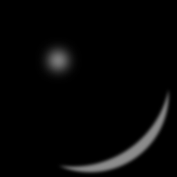
- And finally, apply some light brights, one greater at one side bottom, and a little circle near the center. Add blur effect. The next image have a a black background to may notice them:
Final result
The final resulting image is this:
If needed, add a final parallel sorrounding shadow to the main image. It helps to better see it positioned over the panels and not look so fake.
