Howto:Modeling Ground Signs with Blender
There comes a time when you want to add a few details to an airport in order to improve the realism of your flight experience. Every flight starts (and ends) on the ground, at an airfield. In simulations you generally won't spend too much time there. Generally you will immediately start at the beginning of a runway and be in the air within a few seconds.
There are however people who like learning how to move on the ground too. Learn how to maneuver their aircraft inside the airport. Well, in this case, having good ground signs/markings on the ground is mandatory, because most of the guidance is found there.
Pilots should know what ground signs to pay attention to during every phase of maneuvering, prior to reaching the runway. There are signals painted on the ground and taxi signs on the side of each runway/taxiway. You should also pay attention to tower radio communications and so on. Here you will learn how to build custom ground markings, the ones that are painted on the ground and give you useful information about what you can and cannot do during your ground maneuvering.
| Note FlightGear has switched to a new airport format (apt.dat 850), making it possible to include proper taxiway lines and markings. However some of the ground signs are not yet supported by this format (ex: the kind shown here) and it's still advisable to add them with this technique. Be advised, though, that there's work in progress to have the format support them, and also other kinds of lines. A search for "ground signs" on the forum should give the latest news. Developers have to consider these self made ground signs are not accepted by TerraSync and can only be used for custom sceneries. |
Tutorial files
Right click > Save link as
Holding position markings for CAT II/III operations
In this lesson you will learn how to create a basic ground marking. We will use the one that informs the pilot to HOLD during CAT II/III operations to ensure proper aircraft separation. There are generally a few taxiway signs as well which also help to locate these areas. CAT II/III separation is not that big of an issue in FlightGear. There is still no automatic ground traffic management and aircraft collisions are not very expensive; but this is a real ground marking. We will concentrate on the modeling phase, rather than the functional aspects of the sign.
There is no way FlightGear could position these ground markings automatically. There is no database of where they are or what they look like. Each airport customizes ground marking positions and orientations in order to get maximum efficiency and to help pilots getting correct information without filling the ground with too many of them. Rationalizing communication effectiveness is vital to an airport. Therefore you will create and position them manually.
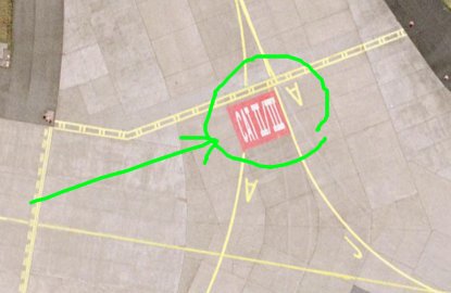
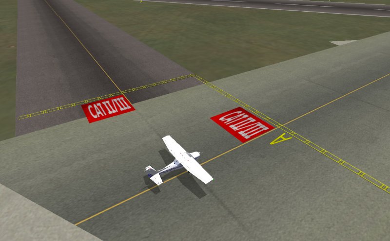
When viewed from the air CAT II/III markings look like this:
They are generally placed in the middle of the runway, following the taxiway yellow line, just before the CAT II/III operations area. Here the pilot must stop and wait for instructions from the ATC.
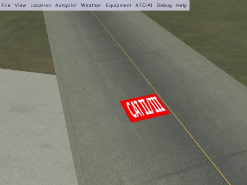
It is a simple red square with the text "CAT II/III" in large white letters. It is stretched out so that when viewed from an aircraft taxing over it, it looks quite proportional.
Modelling the marking with Blender
This is relatively easy. It is a simple textured rectangle. The first thing you need is the correct measurements and a nice texture to put on it. I will create this example with the same measurements used at EDDF Frankfurt airport. The rectangle is 8m wide and 7m high.
I will not explain how to paint the texture because it is covered in other tutorials. Use your preferred painting software, I used The Gimp for this one, save the file in.rgb format and make sure that its size (pixel resolution, not bytes) is a multiple of 8, otherwise FlightGear will not load it. Here you see a JPG version of the texture as an example, download catii-iii.rgb to get the RGB version you need for texturing, it has 512x512 pixel resolution. You can use smaller ones (ex. 128X128) if you think this resolution is too high.
Modelling the rectangle with Blender is easy.
Open Blender; from the main menu choose Add -> Mesh -> Plane
This adds a 2 units width square plane.
Our ground painting is an 8m x 7m rectangle so we have to change the square's dimensions.
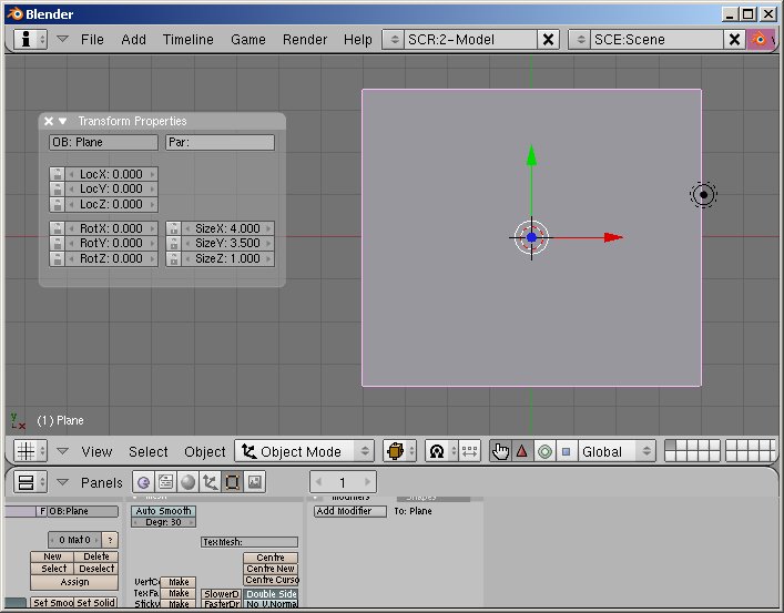
Enter Object mode. Object -> Transform Properties
The Transform Properties window appears. Set “Size X : 4” and “Size Y: 3.5”.
Notice here that the object name is “Plane” (OB: Plane), we will use this information later.
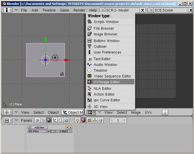
Now you come to the texturing phase. Split the top window in two, and select UV/Image Editor for the right panel:
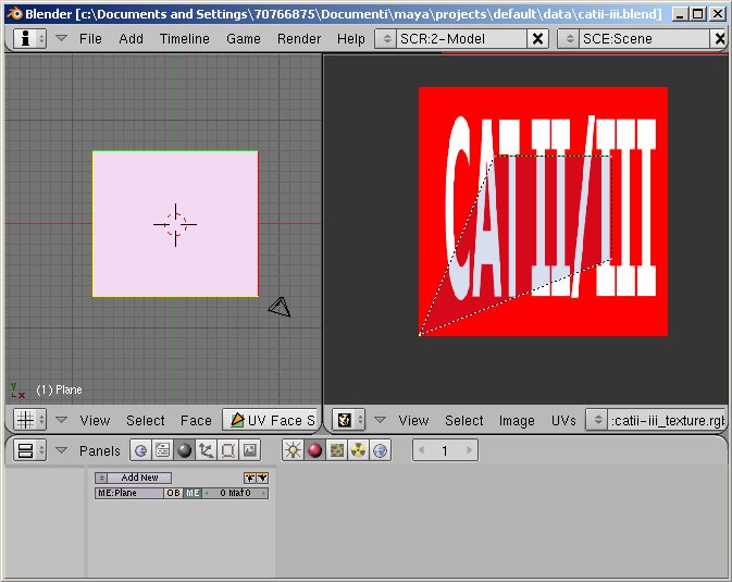
In the 3D View window, select UV Face Select mode, the rectangle face should be still selected, if not, select it by right clicking on the rectangle. Now, while the mouse is in the 3D View window, make sure it's a top view (Numpad 7), hit the U key, and select “From window”.
Now it's time to load the texture file. Inside the right panel, choose Image -> Open ... select the file catii-iii.rgb and hit Open Image.
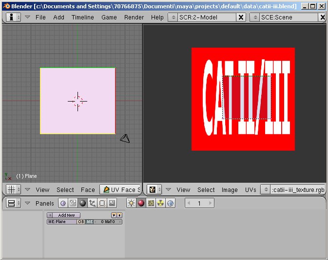
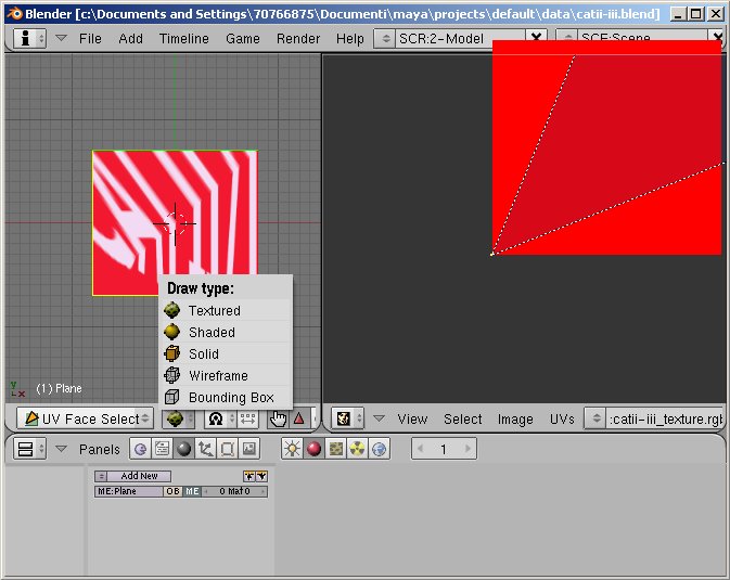
We have to move the rectangle UV vertices in order to make the texture cover the entire rectangle geometry. We will now work in the UV/Image Editor window. Make sure “UVs -> Snap to Pixel” is set, this will make our life easier. Hit the B key, click and drag the mouse around the lower left corner in order to select it. We are not working on the 3d model, we are working on the Uvs, that's why the rectangle in the left window maintains its geometry. Once the vertex is selected, hit the G key (Grab mode) and drag the vertex to the bottom left.
You will need to zoom in a little bit in order to position it precisely, use the CTRL-MMB (MMB = Middle Mouse Button) to zoom in and out, use the SHIFT+MMB to drag the view around. Hit G again, and move the UV vertex into the right position. While doing this, you can select the Textured Draw Mode and interactively see what's happening.
You can select and deselect all UV vertices by hitting the A key.
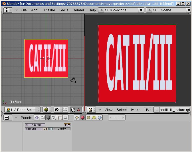
Now hit the A key to deselect the UV vertex; zoom out, hit B, by clicking and dragging select a new UV vertex, hit G and move it with the mouse to the correct position. Then do the same with the remaining two vertices. You will end up with the texture perfectly matching the geometry border:
Now you can go back to Object Mode, make sure the object is selected and export it as AC3D formatted file.
File -> Export -> AC3D (.ac) ... enter a filename and hit “Export AC3D”.
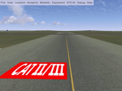
The 3d model is ready and you can place it into your airport scenery now. Make use of Flightgear Scenery Designer, the UFO object placing capability or whatever method you prefer.
Result being:
We will go further and add a few details using an XML file which will describe peculiar attributes of such an object.
Customizing object's attributes into Flightgear using XML
We have three little details here that can be annoying.
1) If you activate Shadow into Flightgear and fly very close (let's say 10meters) to those CAT II/III markings, you will notice that they cast a shadow underneath, especially if the plane has been positioned more then 20cm above the ground. This is not good at all because that should represent a painting on the ground (that could not cast any shadow, there should be no free space between the painting and ground) and a useless shadow consumes GPU power too, which is not desired.
2) If you maneuver an aircraft on the ground, right above the marking, you will notice that the aircraft hits it with the wheels, and jumps a little, just like it encountered an obstacle on the ground. That is not good again, the painting should not oppose any resistance to any ground movement.
3) If you fly high above the airport area you will not really see those little red rectangles, they are too small to be noticed from a height. Nonetheless, Flightgear will still render those little objects on the ground and consume GPU power without really giving any advantage to the simulation experience. That should be avoided, we need to make Flightgear render those markings only when the aircraft is near enough to make them visible to the pilot.
We will eliminate those three cons creating a XML file that covers the issues. Please refer to Flightgear docs in order to get more information about the usage of the XML markup language used.
You can use any text editor you prefer, fill a new empty text file with the following content and save it as catii-iii.xml in the same directory with catii-iii.ac and catii-iii.rgb.
<PropertyList>
 <path>catii-iii.ac</path>

 <animation>
   <type>noshadow</type>
   <object-name>Plane</object-name>
 </animation>

 <animation>
   <object-name>Plane</object-name>
   <enable-hot type="bool">false</enable-hot>
 </animation>

 <animation>
   <type>range</type>
   <object-name>Plane</object-name>
   <min-m>0</min-m>
  <max-property>/sim/rendering/static-lod/detailed</max-property>
 </animation>

</PropertyList>
The <path>catii-iii.ac</path> statement means that all this refers to the 3d object file named catii-iii.ac.
Every animation transformation here applies to the the object called “Plane” inside the catii-iii.ac file (which is our marking rectangle). We could have more then one object inside the .ac file and decide which should cast a shadow and which not. Our example is very simple though, but still this statement has to be included.
1) The first “animation” transformation tells Flightgear not to apply any shadow to it.
2) The second “animation” tells Flightgear not to consider the object “Plane” as an obstacle, so any vehicle will not hit it.
3) The third “animation” tells Flightgear to render the object “Plane” only if the distance between it and the viewer is more then 0 meters and less then the value stored in Flightgear tree with the name /sim/rendering/static-lod/detailed. This value is a number that can be user customized; the default value is 1500m. When the object is more then 1500 meters distant, Flightgear will not render it; at such a distance you barely see a 8m x 7m square painting on the ground.
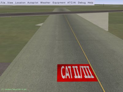
Now, insert the 3d object into your scenery but do not use the .ac file, make use of the .xml file instead; it will call the corresponding .ac file when needed. The following snapshot includes the yellow ILS critical area boundary stripes and the taxiway A ground marking which I made using the same technique, the only difference being those have partially transparent texture file.
Adding some realism to the texture
Aircraft and ground vehicles do move above those markings, that makes them dirty after a short while. I like adding a touch of realism to the textures I use into my Flightgear models. Adding some dirt to the ground marking is pretty easy. I'll show you how to modify the texture with The Gimp, you can use similar techniques with every common graphic editor.
Open up Gimp and load the file catii-iii.rgb
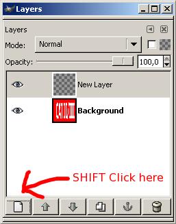
Create a new layer by SHIFT clicking on the left button of the Layers Dialog Box:
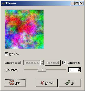
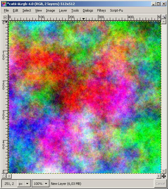
In the image window, go to: Filters -> Render -> Clouds -> Plasma ...
You can customize the Clouds rendering settings in order to get a nicely random cloud rendering. Now, you just use what I suggest in the picture and hit OK. It does not matter if it looks colored now, we will convert to greyscale and use the light values only to add some noise to the underlaying layer.
You will get this in your image window.
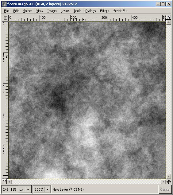
Erase the saturation with: Layer -> Colors -> Desaturate
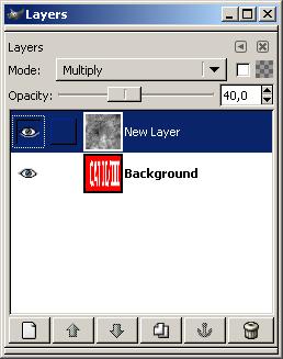
Return to the Layers dialog box, change the clouds layer mode to Multiply and the Opacity to 40.
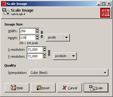
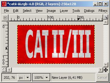
I also tend not to use huge texture files, that's why I rescale it to smaller resolution; keep in mind that we need it to be a multiple of 8; in this case I decided a 256x128pixel resolution would look good enough. In the image window: Image -> Scale Image ...
Unlock the resolution proportion constrains by clicking on the little chains at the right of the Image Size resolution boxe (the chain opens up in two pieces), then set Width:256, Height:128 and hit Scale.
Now the image is ready to be saved with RGB format as usual, and can replace the old one. The result in Flightgear looks more realistic then the previous one, that bit of dirt smooths out the visual break caused by the perfectly clean texture used before. It integrates better with the surrounding taxiway texture.
I hope you will enjoy this little lesson. Consider this as an example, because there are a lot more things to do with the XML animations provided by Simgear to Flightgear.
