User:Owenpsmith/Preparing drawings for modelling
This tutorial explains the steps I use to prepare scanned drawings in Gimp for use in building an aircraft model in AC3D.
Good quality models start with good quality drawings, but even the best drawings have issues. Some are not 100% accurate or do not represent production specs, or are not quite square or symmetrical. Even if they are absolutely perfect, issues can be introduced during scanning. Despite our greatest attempts to scan them straight, they are never 100% perfect. I use the following steps to ensure my drawings give me a solid start on my model, to reduce issues later on and improve overall accuracy.
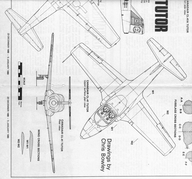
I will be using the development of the Canadair Tutor for this tutorial (how appropriate!). I use Gimp for my graphics work, but the general techniques can be used in any photo editing software. As this is not a Gimp tutorial and you may be using your own software, I will not go into details on the Gimp interface except where I feel it is necessary. If you are using Gimp, I have installed the Straighten and Crop plugin. I am starting with some scanned 3-view drawings with cross sections, and some reference photos that are roughly orthogonal.
Top View
We will start with the top view since length and wing span are more precise than height:
In this case the top view is at 45° on the sheet, but even if it is "straight" we will still try to straighten it perfectly in this step.
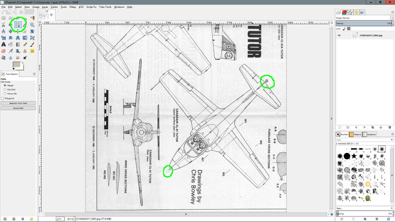
Select the Path tool and click on a point at each end of the marked center line.
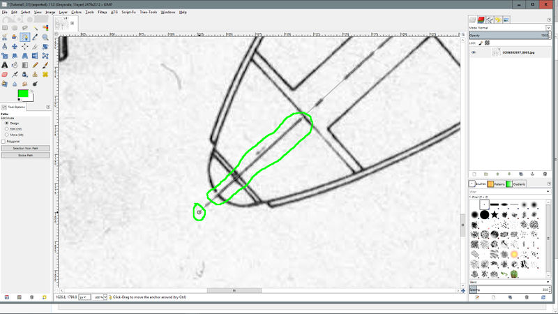
Zoom in and place each end of the path more precisely.
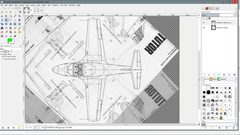
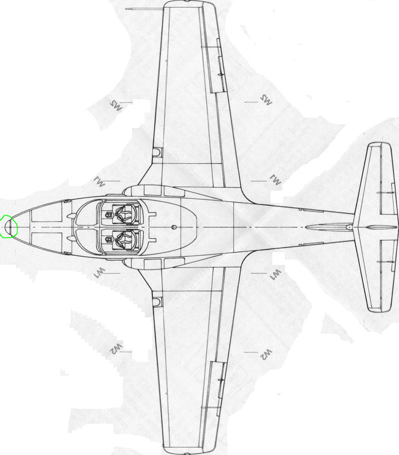
Select Tools -> Transform Tools -> Straighten and Crop. If it is a 45° rotation, set Crop after rotating to "No crop". Click "Ok". If part of your drawing has been clipped off, you can either drag it into the middle or select Image -> Fit Canvas to Layers. The nose of the aircraft should be pointing to the left, if it is not then rotate it using Image -> Transform menu.
We will now ensure the drawing is square and symmetrical. Duplicate the layer and set the opacity of the top layer to 50%. Flip the top layer and move it so that the center line of the top view lines up with that of the bottom layer. Fine tune the position of the top layer until it most closely matches the bottom layer. In this case it is pretty close, but there is some slight blurring on the outer wings and tips of the horizontal stabilizers, but it is pretty square overall. Since it is close, I will use this image as is with both layers showing, and I will run the outline of my model down the middle of the lines where there is some slight blurring. We can merge these two layers together now to simplify things later.
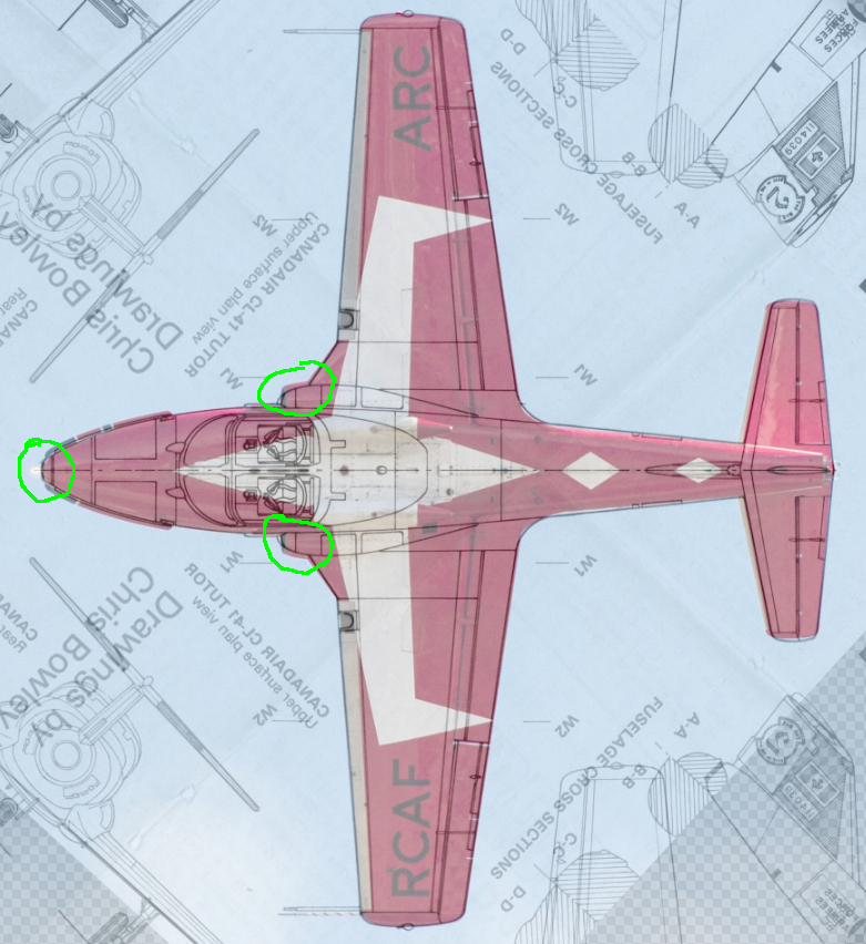
Next we will check for accuracy of the drawings by comparing it to a reference photo. Open the reference photo as a new layer on top of the drawing layers and set its opacity to 50%. Scale and move the image until its outline lines up with that of the drawing. Note that all photos will have some perspective distortions and parallax, so not all misalignments with a reference photo are bad.
We can see now that there are some inaccuracies in the engine inlet areas, as well as the very front of the nose. I will leave this photo in as a layer in the master but will hide it when I save a jpg for use in AC3D. I will include the layer again later when I am working on these areas.
We can now crop the drawing to the very edge of the model and clean up extraneous drawings, but be sure to leave in any cross-section references. When cropping, use the select tool with the aspect ratio option set to the aspect ratio of the aircraft base on documented aircraft dimensions. In this case you can see that this results in the aircraft length being a bit short, but this can be explained by the drawing having a stubbier nose that the real aircraft, so we are all good.
Side View
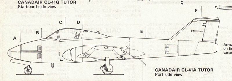
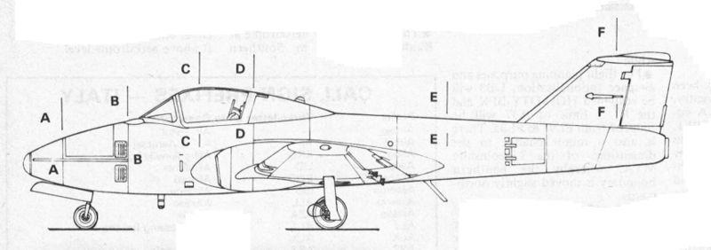
Aligning the side view can be a bit more tricky since it does not have a center line and may not have any other reference line. We usually want the fuselage frame members (formers) to be vertical, as these sometimes correspond to internal structures, as well as paint lines. For the Tutor, it looks at first glance that we could use the stripe down the side of the Snowbirds aircraft as a reference, however it is actually not perfectly perpendicular to the formers. In this case, I will use try using the ground lines under the landing gear and then verify the formers are vertical. I will straighten the image using the Straighten and Crop tool again. The rectangle select tool is very handing for giving both vertical and horizontal line references, and looks like the formers are now vertical.
Which gives us a straightened side view.
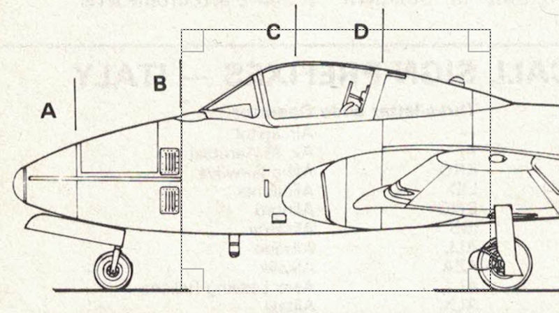
Before moving on to comparing against a reference image, lets move some of the cross section references inside the fuselage area so they don't get cropped off later. You can copy/paste them and then use the arrow keys with the move tool to move only on one axis. We'll also take this opportunity while we are manually editing to clean up the extra drawing lines.
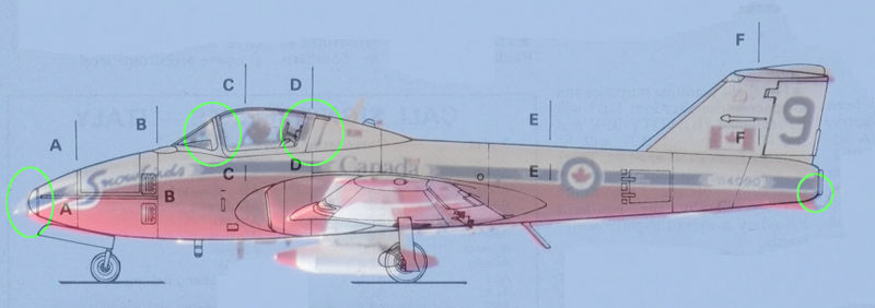
There is no need to check for symmetry for the side view, so lets move on to verifying the accuracy against a reference image. Import the reference image as a new layer and move and scale as necessary to align it with the drawing. Here we can see the same nose issues we saw in the top view, but also see some canopy and exhaust issues. We will make note of these for later and keep the image as a layer in the master copy so we can show it again when we are working on these areas.
We can now crop it tight to the outside of the drawing, keeping in mind we need the same buffer ahead of the nose as we did in the top view.
Front View
We will process the front view similarly to the top view, with a symmetry and reference image check, but like the side view we won't worry too much about height. I'm really only including the front view in the tutorial because it has some major inaccuracies that we will fix in the scan itself.
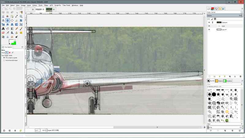
This is the drawing after I have straightened it and added a reference image as a new layer with 50% opacity on top. As you can see the wings have waaaay too much dihedral. I didn't need a reference image to know the dihedral was a bit off, but it will help us set it straight (so to speak).
To fix this, I will free select the wing and run the selection through the simplest part of the landing gear leg.
I will then use the shear tool to shear it vertically, so that the width stays the same. I will then need to reposition it a little vertically to line up with the reference image. I will make a copy of the layer, flip it horizontally, then move it over to the other side to fix it as well. This gives us the following image. We can also have a look for other issue when comparing with the reference image. We can see that the main gear wheels are way to big (tundra tires on a Tutor?), the nose ahead of the canopy is too rounded, and the point of the nose at the nose light is too high. These were better aligned in the top and side views so we will use those for the nose along with cross sections which we will do next.
Finally we will hide the reference in the master image and save it as a jpeg for importing into AC3D
Cross sections
I will do one cross section as an example, the others can be added similarly. The plans I have been using so far have very basic "outer skin" cross sections, but I also have some from the maintenance manual that show the internals. The one problem is that they were photographed rather than scanned, so there is a good possibility they have some perspective issues.
The darker portion of the image was not sitting as flat as the lighter section, so we will work from the lighter section as it will have less distortion. Use the rectangle select tool to select the left half of the cross section, up to the center line. Copy it, paste it as a new layer, then flip it horizontally. Move it over to the right side and line it up on the center line. By setting the opacity to 50%, we can see that the new layer extends significantly past the original lines for the right side. This is due to the paper not being flat, but we have fixed it now by using the better copy from the other side.
Set the opacity back to 100% and merge the layers. Crop the image tightly to the edges of the cross section and we're done. The aspect ratio may not be perfect, but we will look at that once we import it into AC3D.
. . and we're done! Please see my next tutorial to see how I use these drawings in AC3D.
