Howto:Creating a Canvas GUI Widget
 |
The FlightGear forum has a subforum related to: Canvas |
As the integrated, and fully script-able, Canvas GUI develops, new widgets  need to be added [1]. This article shows how to create a Canvas GUI widget.
Background
Originally, suggested and discussed back in early 2014 by a few FlightGear core developers, the pui2canvas approach to parsing a subset of PUI/XML and mapping that to Canvas widgets/properties, has turned out to be a suitable fasttrack solution to get rid of the legacy PUI engine, without causing major regressions or tons of work. It seems, that probably nobody would object against removing PUI and replacing it by CUI, keeping the old PUI/XML syntax. At least for a while. Dropping PUI would be a huge step forward.[2]
For the time being, this approach has a number of major advantages, i.e. it has proven to be able to deal with existing UI resources (dialogs, and the Menubar), without the original legacy UI dialogs (or any C++ code) having to be touched/modified, so that the primary thing missing to parse/process these dialogs are a handful of missing Canvas widgets, which can also be implemented in scripting space usually.
Besides, this approach also is the only effort that can easily support procedurally created and updated dialogs like Aircraft Checklists, Tutorials, Joystick Configuration (as well as a number of custom aircraft dialogs).
Also, the pui2canvas approach can help address a number of long-standing PUI related issues, such as rendering arttfacts on some ATI/AMD GPUs, but also PUI/Canvas inter-operability issues related to Canvas Event Handling.
Status
|
|
Back in June 2016, there were just five widgets in the Canvas GUI:
- fgdata/Nasal/canvas/gui/widgets/Button.nas
- fgdata/Nasal/canvas/gui/widgets/CheckBox.nas
- fgdata/Nasal/canvas/gui/widgets/Label.nas
- fgdata/Nasal/canvas/gui/widgets/LineEdit.nas (editable text box)
- fgdata/Nasal/canvas/gui/widgets/ScrollArea.nas (for scrollable content)
In contrast, the PUI subsystem in FlightGear supports ~15 documented widgets (see $FG_ROOT/Docs/README.gui#l219 for a list of widgets made available to FlightGear via PUI/XML).
For a complete list (including custom/undocumented widgets), refer to FGPUIDialog::makeObject() in flightgear/src/GUI/FGPUIDialog.cxx (line 850)
In addition, FlightGear introduces a handful of custom PUI widgets implemented in C++ space, that not even PUI itself supports directly:
<airport-list>(README.gui#l365 | C++ code) flightgear/fgdata/next/gui/dialogs/airports.xml#l393<waypointlist>(README.gui | C++ code) (only used by the Route Manager i.e. flightgear/fgdata/next/gui/dialogs/route-manager.xml#l590<property-list>(README.gui#l375 | C++ code) (only used by the Property browser i.e. flightgear/fgdata/next/gui/dialogs/property-browser.xml#l55
However, many PUI widgets can be emulated/approximated by using a combination of existing widgets, and/or functionality found in existing widgets, i.e. by referring to their source code.
For instance, all the data needed to obtain a list of airports or waypoints can be queried using the Navdb APIs exposed via Nasal/CppBind, specifically:
- findAirportsWithinRange()
- findNavaidsWithinRange()
At this point, we can map arbitrary navdb calls to help populate a ScrollArea with entries.
Thus, what is primarily needed to implement support for arbitrary -list types is a ScrollArea that uses buttons (or labels) for each entry.
As of late June 2016, the following widgets are primarily needed to help getting rid of PUI (listed in ascending complexity):
<vrule>(README.gui#l508 | C++ code) (not critical, could be implemented OpenVG or simply by using a transparent image)<hrule>(README.gui#l508 | C++ code) (not critical, could be implemented OpenVG or simply by using a transparent image)<radio>(README.gui#l577 | C++ code) (Canvas images using event handling to dynamically change the image based on mouse events)<slider>(README.gui#l429 | C++ code) (basically 3 buttons with the middle button supporting dragging, see also [1])<dial>(README.gui#l459 | C++ code) (see also [2])<combo>(README.gui#l330 | C++ code) (popup with a scrollArea that has buttons for each item (can be shared with<select>)
The key ones really being the last 4 in that list (radio, slider, dial and combo/dropdown)
The <canvas> (README.gui | C++ code) widget is particularly easy to support, because it's just an embedded canvas that can be treated as a Canvas Image with its own Nasal code running to update the whole thing.
Most other widgets currently missing can be implemented by using a combination of these widgets, e.g. a ScrollArea with buttons can be used to implement any type of list (airportlist, waypointlist, property-browser etc), just by adding event handling callbacks to each entry/button that invoke the corresponding bindings:
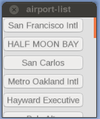
airport-list widget re-implemented using Canvas ScrollArea and Buttons arranged in a VBox layout
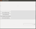
crude property-browser approximation using the pui2canvas parser (unmodified dialog), no layouts or sorting applied


This ScrollArea-based approach has the added benefit that improvements to the ScrollArea widget will automatically benefit widgets using it internally.
However, once these basic widgets are supported, additional FlightGear/flight simulation specific widgets may be implemented sooner or later, e.g. for picking a frequency, heading/course etc (see UI_Unification#Widget_tags).
Widget.nas
This is the base class for all widgets, all widgets must inherit from it, or from any of its child classes - it can be found in $FG_ROOT/Nasal/canvas/gui/Widget.nas, its main methods are:
new()(constructor)setFixedSize()setEnabled()move()setSize()setFocus()clearFocus()onRemove()- ...
Widget.nas is a scripting space wrapper for the lower-level NasalWidget module (see Nasal/CppBind) in simgear/layout: https://sourceforge.net/p/flightgear/simgear/ci/next/tree/simgear/canvas/layout/NasalWidget.cxx
The wrapper is registered and set up in $FG_SRC/Scripting/NasalCanvas.cxx: https://sourceforge.net/p/flightgear/flightgear/ci/next/tree/src/Scripting/NasalCanvas.cxx#l543
Part one
A new Canvas widget will have two parts to it.
The first provides the background code and the APIs for that widget. The second defines the appearance of the widget, i.e. its style.
The first part is a Nasal file in $FG_ROOT/Nasal/canvas/gui/widgets, e.g., . They must follow the basic structure of the example below, replacing
 gui.widgets.myWidget = {
    # our constructor
    new: func(parent, style, cfg){
        var m = gui.Widget.new(gui.widgets.myWidget);
        m._cfg = Config.new(cfg);
        m._focus_policy = m.NoFocus;
        m._setView(style.createWidget(parent, "myWidget", m._cfg));

        return m;
    }, # new() constructor
    # widget-specific APIs come below, e.g., setText()
 };
Notes:
- the file name, and class name, are by convention using a capital letter
- All widgets inherit from
canvas.gui.Widget(or any of its child classes). - The configuration hash can be used to alter the function of the widget.
- The string
"mywidget"corresponds to the name of the widget below. - In order the access methods in the code in next section, use
me._view.<API>. MVC - In order to access the top-level root group, use me._view._root, to see what else is available, use debug.dump(me._view)
Part two
The second part is a section contained in $FG_ROOT/Nasal/canvas/gui/styles/DefaultStyle.nas.
The example below shows the minimum code needed, replace mywidget with your widget's name:
 DefaultStyle.widgets.mywidget = {
    new: func(parent, cfg){
        me._root = parent.createChild("group", "mywidget");
    },
    setSize: func(model, w, h){
        # ...
        # code for changing size
        # ...

        return me;
    },
    update: func(model){}
    # other APIs below, e.g., setBackground()
};
Notes:
- the
setSize()andupdate()methods must exist, althoughupdate()may be empty. - Some APIs from Part 1, especially ones that change the widget's appearance/size, will need to fall to this code, see note above.
- In particular, the layout logic (e.g. hbox, vbox) need a way to notify a widget that it needs to be updated/resized, which is accomplished through these methods
Accessing colors
The colors of some parts of the Canvas GUI are loaded from $FG_ROOT/gui/styles/AmbianceClassic/style.xml (note that AmbianceClassic is, as of June 2016, the only style). You can define colors for your new widget there and access them in from the code above using, for example, me._style.getColor("<color name>");.
Background images
If your widget needs background images (e.g., the button widget), they must be placed in $FG_ROOT/gui/styles/AmbianceClassic/widgets (again, AmbianceClassic is the only style as of June 2016). You can then find their folder using me._style._dir_widgets. See the fgdata/Nasal/canvas/gui/widgets/Button.nas widget for an example.
In general, Canvas widgets will need some custom artwork - for the time being, Tom simply reused existing artwork, e.g. from Lubuntu/gtk (see the CheckBox implementation for reference) The corresponding artwork resides in $FG_ROOT/styles/AmbianceClassic: fgdata/gui/styles/AmbianceClassic/style.xml
Part three
All that remains is registering the new widget. To do this, open $FG_ROOT/Nasal/canvas/gui.nas and add a new loadWidget("myWidget"); to the section where the others are loaded (line 23 onwards), for example:
loadWidget("myWidget");Notes:
- The argument corresponds to the name of the Nasal file in $FG_ROOT/Nasal/canvas/gui/widgets.
Examples
| This article is a stub. You can help the wiki by expanding it. |
Implementing a slider widget
We can approximate a simple slider by using three buttons, with the middle button having a registered drag/drop listener, so that it can be repositioned accordingly
 gui.widgets.slider = {
    # our constructor
    new: func(parent, style, cfg){
        var m = gui.Widget.new(gui.widgets.slider);
        m._cfg = Config.new(cfg);
        m._focus_policy = m.NoFocus;
        m._setView(style.createWidget(parent, "slider", m._cfg));

        return m;
    }, # new() constructor
    # widget-specific APIs come below, e.g., setText()
 };
To support both, vertical and horizontal, sliders, it makes sense to use the config hash and add a mode attribute to it, which may contain either horizontal or vertical
For an example, we can refer to the ScrollArea.nas code which is doing this sort of thing already.
Implementing a radio button
To implement a radio buttno widget, it makes sense to look at Button.nas and CheckBox.nas - i.e. we need a button that changes its background image based on being selected/hovered - which is basically what the checkbox is doing, too:
To implement a simple dropdown/combo widget, we mainly need the following functionality:
- a ScrollArea
- a vbox layout
- buttons for each entry added to the ScrollArea
Thus, instead of inheriting from gui.Widgets, we can directly inherit our combo widget from ScrollArea:
 gui.widgets.combo = {
    # our constructor
    new: func(parent, style, cfg){
        var m = gui.widgets.ScrollArea.new(gui.widgets.combo);
        m._cfg = Config.new(cfg);
        m._focus_policy = m.NoFocus;
        m._setView(style.createWidget(parent, "combo", m._cfg));

        return m;
    }, # new() constructor
    # widget-specific APIs come below, e.g., setText()
 };
Due to inheriting directly from the ScrollArea widget, we now have access to all its functionality:
setLayout()getContent()setColorBackgrond()setSize()scrollTo()- ...
Implementing a graph widget

 gui.widgets.graph = {
    # our constructor
    new: func(parent, style, cfg){
        var m = gui.Widget.new(gui.widgets.graph);
        m._cfg = Config.new(cfg);
        m._focus_policy = m.NoFocus;
        m._setView(style.createWidget(parent, "graph", m._cfg));

        return m;
    }, # new() constructor
    # widget-specific APIs come below, e.g., setText()
 };
Implementing a Map widget
|
|
 |
Work in progress This article or section will be worked on in the upcoming hours or days. See history for the latest developments. |

Assuming, we have access to a root group, the most minimal snippet of code to display a layered MapStructure map is the following:
var TestMap = root.createChild("map");
TestMap.setController("Aircraft position");
TestMap.setRange(25);

TestMap.setTranslation(width, height);
     var r = func(name,vis=1,zindex=nil) return caller(0)[0];
     foreach(var type; [r('VOR'),r('APT'), r('APS') ] )
            TestMap.addLayer(factory: canvas.SymbolLayer, type_arg: type.name, visible: type.vis, priority: type.zindex,);
Next, we need to wrap this in a Widget.nas child class and add the corresponding boilerplate code to DefaultStyle.nas:
diff --git a/Nasal/canvas/gui/widgets/Map.nas b/Nasal/canvas/gui/widgets/Map.nas
new file mode 100644
index 0000000..d26a902
--- /dev/null
+++ b/Nasal/canvas/gui/widgets/Map.nas
@@ -0,0 +1,25 @@
+gui.widgets.Map = {
+  new: func(parent, style, cfg)
+  {
+    var m = gui.Widget.new(gui.widgets.Map);
+    m._cfg = Config.new(cfg);
+    m._focus_policy = m.NoFocus;
+    m._setView( style.createWidget(parent, "map", m._cfg) );
+
+    var TestMap = m._view._root.createChild("map");
+    TestMap.setController("Aircraft position");
+    TestMap.setRange(35);
+
+     TestMap.setTranslation(640/2, 480/2);
+     var r = func(name,vis=1,zindex=nil) return caller(0)[0];
+     foreach(var type; [r('VOR'),r('APT'), r('APS') ] )
+            TestMap.addLayer(factory: canvas.SymbolLayer, type_arg: type.name, visible: type.vis, priority: type.zindex,);
+
+    return m;
+  },
+  setBackground: func(bg)
+  {
+    me._view.setBackground(me, bg);
+    return me;
+  }
+};
diff --git a/Nasal/canvas/gui/styles/DefaultStyle.nas b/Nasal/canvas/gui/styles/DefaultStyle.nas
index 4d3de27..1f26dd4 100644
--- a/Nasal/canvas/gui/styles/DefaultStyle.nas
+++ b/Nasal/canvas/gui/styles/DefaultStyle.nas
@@ -451,3 +451,20 @@ DefaultStyle.widgets["scroll-area"] = {
     model._scroller_delta[dir] = model._size[dir] - model._scroller_size[dir];
   }
 };
+
+DefaultStyle.widgets.map = {
+    new: func(parent, cfg){
+        me._root = parent.createChild("group", "map");
+    },
+    setSize: func(model, w, h){
+        # ...
+        # code for changing size
+        # ...
+
+        return me;
+    },
+    update: func(model){
+       }
+    # other APIs below, e.g., setBackground()
+};
+
To actually instantiate the widget, use something along these lines (via the Nasal Console):
var (width,height) = (640,480);
var title = 'MapStructure widget test';

# create a new window, dimensions are WIDTH x HEIGHT, using the dialog decoration (i.e. titlebar)
var window = canvas.Window.new([width,height],"dialog").set('title',title);

# adding a canvas to the new window and setting up background colors/transparency
var myCanvas = window.createCanvas();

# Using specific css colors would also be possible:
myCanvas.set("background", "#ffaac0");

# creating the top-level/root group which will contain all other elements/group
var root = myCanvas.createGroup();


# create a new layout
var myLayout = canvas.HBoxLayout.new();

# assign it to the Canvas
myCanvas.setLayout(myLayout);

var map = canvas.gui.widgets.Map.new(root, canvas.style, {});

myLayout.addItem(map);
Everything that we'd like to be able to customize at the widget level, needs to be exposed via a corresponding method added to the subclass inheriting from Widget.nas, for example:
- setController()
- setRange()
- setLayers()
- ...
In addition, most MapStructure symbology, appearance (scaling, styling etc) and behavior can be customized by overriding the defaults (which are otherwise still based on the original 744 ND implementation). For an example, see flightgear/fgdata/next/gui/dialogs/map-canvas.xml#l362:
| Note The Styles/Options hashes must have one entry for each added layer matching its name |
                        ##
                        # Styling: This is a bit crude at the moment, i.e. no dedicated APIs yet - but it's
                        # just there to prototype things for now
                        var Styles = {};
                        Styles.get = func(type) return Styles[type];
                        var Options = {};
                        Options.get = func(type) return Options[type];

                        ## set up a few keys supported by the DME.symbol file to customize appearance:
                        Styles.DME = {};
                        Styles.DME.debug = 1; # HACK for benchmarking/debugging purposes
                        Styles.DME.animation_test = 0; # for prototyping animated symbols

                        Styles.DME.scale_factor = 0.4; # 40% (applied to whole group)
                        Styles.DME.line_width = 3.0;
                        Styles.DME.color_tuned = [0,1,0]; #rgb
                        Styles.DME.color_default = [1,1,0];  #rgb

                        Styles.APT = {};
                        Styles.APT.scale_factor = 0.4; # 40% (applied to whole group)
                        Styles.APT.line_width = 3.0;
                        Styles.APT.color_default = [0,0.6,0.85];  #rgb
                        Styles.APT.label_font_color = Styles.APT.color_default;
                        Styles.APT.label_font_size=28;
To approximate the appearance of the legacy Map dialog, we will be using a hbox layout with two columns, with the left column containing a vbox layout with checkboxes added for each layer to control visibility of the layer, and the right hbox cell containing the actual MapStructure map:
Once we are finished, we can check if the widget is working properly by adding a handful of identical widgets to the same dialog, all of which should work independently, i.e. having their own checkbox/range widgets to control the corresponding map widget.
References
References
|